<dkl-discount-badge> — the data-* attributes that drive
its behaviour and the --dkl-badge-* tokens that style it. The app
block settings map onto these; on a web component
you set them directly.
Using this reference with the app blockWhen you place the DK: Discount Badge app block, it
renders its own
<dkl-discount-badge> and writes these values for you — so what applies depends
on the kind of override:Data attributes — No:
The block sets every data-* itself, from its App block settings and the resolved discount. Adding data-* to your own markup has no effect on a block instance; they’re the configuration surface for the web component only. To change block behaviour, use its settings.CSS styling tokens — Yes:
They’re CSS custom properties that inherit through to the host, so they style a block exactly like a web component. The block’s colour / radius / spacing / font pickers just write the matching tokens into a scoped <style> rule for you. Any token not exposed as a setting you can still set yourself from your own CSS — :root, the embed’s Custom CSS field, or a rule targeting the block.This component is light-DOM, host-only — the host element is the badge. There’s no shadow DOM, so there are no CSS parts: style the host element directly (dkl-discount-badge { … }).Data attributes
All optional — the carrier (or your own Liquid) supplies them. Set one to override.Which amount to show — the percent, the cents, or whichever saves more.
highest is
computed against the current variant price (percent × price vs the fixed cents); ties
favour the percentage, and a missing side falls back to the other.The percentage amount (rounded for display).
The fixed amount (money-formatted).
The variant price; drives the
highest comparison (recomputed on variant change).Money format for the
fixed amount.Label template;
[amount] is replaced with the formatted amount.The component hides the host only when it can compute that there’s nothing to show and
there’s no server-rendered text already. Without the
data-* attributes it leaves the
server text alone.CSS styling tokens
dkl-discount-badge { … } (there are no CSS parts). Set any
token above the element — :root, the embed’s Custom CSS, an inline style, or the block’s
scoped rule.
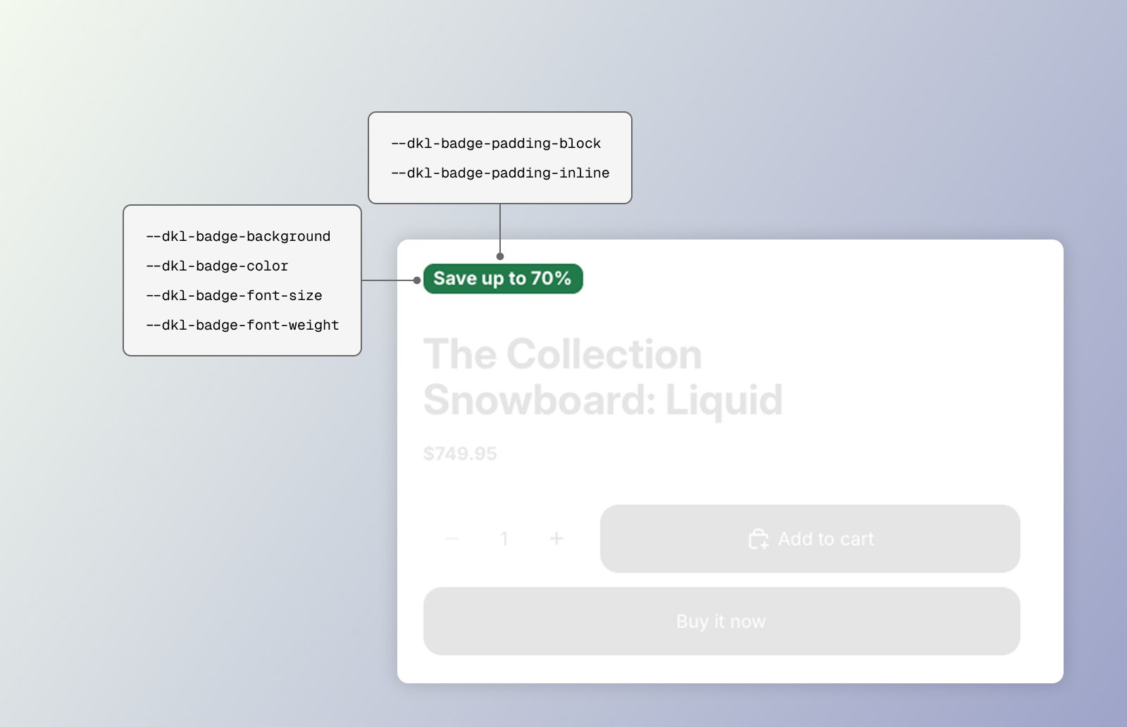
Badge background.
Badge text.
Badge corners.
Vertical padding.
Horizontal padding.
Badge text size.
Badge text weight.
<style> rule.
Examples
Restyle a single badge inline
Style the host via :root tokens
Target the host element directly
Next steps
App block
Configure these via theme-editor settings.
Web Components
Set these directly on the tag.