Styling & Data Attributes
This is the reference for <dkl-quickview> — the data-* attributes that configure a
trigger, the delegated data-dkl-quickview-* attributes for opening from any element, the
--dkl-* tokens the dialog inherits, and the ::part() surface for restyling it.
Two elements are involved:
- Triggers — your
<dkl-quickview data-product-handle="…">elements. Data attributes go here; their content is yours to style however you like. - The dialog host — a single headless
<dkl-quickview data-dkl-dialog-host>the runtime appends to<body>on first open. The<dialog>lives in its shadow root, styled by the embed’s stylesheet. Parts are exposed on this host.
Data attributes
Section titled “Data attributes”Set as data-* on a trigger. Every attribute has a camelCase twin on the
JavaScript API.
Product
Section titled “Product”data-product-handle
Section titled “data-product-handle”handle | comma-separated handles · default: (the Liquid seed's product)
The product to load. Required unless a Liquid product seed or data-product-id supplies
the product. A comma-separated list opens the multi-product picker.
data-product-id
Section titled “data-product-id”id | gid | comma-separated · default: (none)
Stable alternative to the handle (numeric or gid://shopify/Product/…). Resolved through the
Storefront API source; pair it with a handle on the Ajax fallback. A comma-separated list
opens the picker.
data-variant-id
Section titled “data-variant-id”int · default: (first available)
Preselect this variant after load.
data-money-format
Section titled “data-money-format”string · default: shop money format
Money format for price rendering.
data-prefetch
Section titled “data-prefetch”"visible" | "eager" | "hover" | "off" · default: visible
When to fetch the product in the background so the first open renders instantly.
visible fetches once the trigger nears the viewport (a grid only fetches what the
shopper can reach); eager fetches on mount; hover only warms on pointer or focus;
off never prefetches. Hover/focus warming stays on in every mode except off. A Liquid
seed makes all of this a no-op.
Behaviour
Section titled “Behaviour”data-close-on-add
Section titled “data-close-on-add”"true" | "false" · default: false
Close the dialog after a successful add-to-cart.
data-show-qty
Section titled “data-show-qty”"true" | "false" · default: true
Show the quantity stepper. When false, it’s hidden, the add-to-cart button takes the full
row, and the preset quantity is what gets added.
data-qty
Section titled “data-qty”int · default: min-qty
Preset quantity. Clamped into [min-qty, max-qty]; applies even when the stepper is
hidden. Starts on the matching volume tier when the product has one.
data-min-qty
Section titled “data-min-qty”int · default: 1
Minimum quantity. The stepper and typed input never go below it.
data-max-qty
Section titled “data-max-qty”int · default: unlimited
Maximum quantity. The stepper and typed input never exceed it.
data-allow-qty-change
Section titled “data-allow-qty-change”"true" | "false" · default: true
When false, the stepper stays visible but inert (buttons disabled, input read-only); the
preset quantity is what gets added.
data-line-prop-key
Section titled “data-line-prop-key”string · default: (none)
Attach a line-item property to every cart add. The property name is the key, prefixed by
data-line-prop-namespace as namespace.key when set. Prefix with _ to hide it in most
themes’ cart display.
data-line-prop-namespace
Section titled “data-line-prop-namespace”string · default: (none)
Optional namespace for data-line-prop-key.
data-line-prop-value
Section titled “data-line-prop-value”string · default: ""
The property’s value.
data-show-volume
Section titled “data-show-volume”"true" | "false" · default: true
Mount a Volume Picker per eligible volume discount below the options. Tier selection syncs the quantity and discounts the add-to-cart price.
Headings
Section titled “Headings”data-picker-heading
Section titled “data-picker-heading”string · default: Choose a product
Header heading on the multi-product picker screen.
data-options-heading
Section titled “data-options-heading”string · default: Choose your options
Header heading on the options screen. On single-product opens it fills the otherwise-empty header.
boolean attribute
Declarative open/close. Reflected while this trigger’s dialog is open.
data-widget-id
Section titled “data-widget-id”string · default: null
Instance id, carried on the mount / unmount events.
data-dkl-quickview-ignore
Section titled “data-dkl-quickview-ignore”boolean attribute · on a descendant
Clicks on (or inside) this descendant don’t open the dialog.
Liquid seeds
Section titled “Liquid seeds”Not attributes, but children of a trigger — both are <script type="application/json">
elements:
data-dkl-quickview-product
Section titled “data-dkl-quickview-product”{{ product | json }}
The product itself. Warms the cache so the open needs no request, and stands in for
data-product-handle. See Product cards.
data-dkl-quickview-swatches
Section titled “data-dkl-quickview-swatches”{ [optionName]: { [valueName]: { color?, image? } } }
Colour / image swatches for the Ajax fallback (the Storefront API source supplies them itself). See Swatches without the Storefront API.
Delegated opener attributes
Section titled “Delegated opener attributes”Any element with data-dkl-quickview (a handle, or a comma-separated list) or
data-dkl-quickview-id (an id, or a list) opens the dialog on click, with no wrapping.
The remaining options are the trigger attributes prefixed data-dkl-quickview-:
| Delegated attribute | Trigger equivalent |
|---|---|
data-dkl-quickview |
data-product-handle |
data-dkl-quickview-id |
data-product-id |
data-dkl-quickview-variant-id |
data-variant-id |
data-dkl-quickview-show-qty |
data-show-qty |
data-dkl-quickview-qty |
data-qty |
data-dkl-quickview-min-qty |
data-min-qty |
data-dkl-quickview-max-qty |
data-max-qty |
data-dkl-quickview-allow-qty-change |
data-allow-qty-change |
data-dkl-quickview-line-prop-namespace |
data-line-prop-namespace |
data-dkl-quickview-line-prop-key |
data-line-prop-key |
data-dkl-quickview-line-prop-value |
data-line-prop-value |
data-dkl-quickview-picker-heading |
data-picker-heading |
data-dkl-quickview-options-heading |
data-options-heading |
data-dkl-quickview-show-volume |
data-show-volume |
CSS styling tokens
Section titled “CSS styling tokens”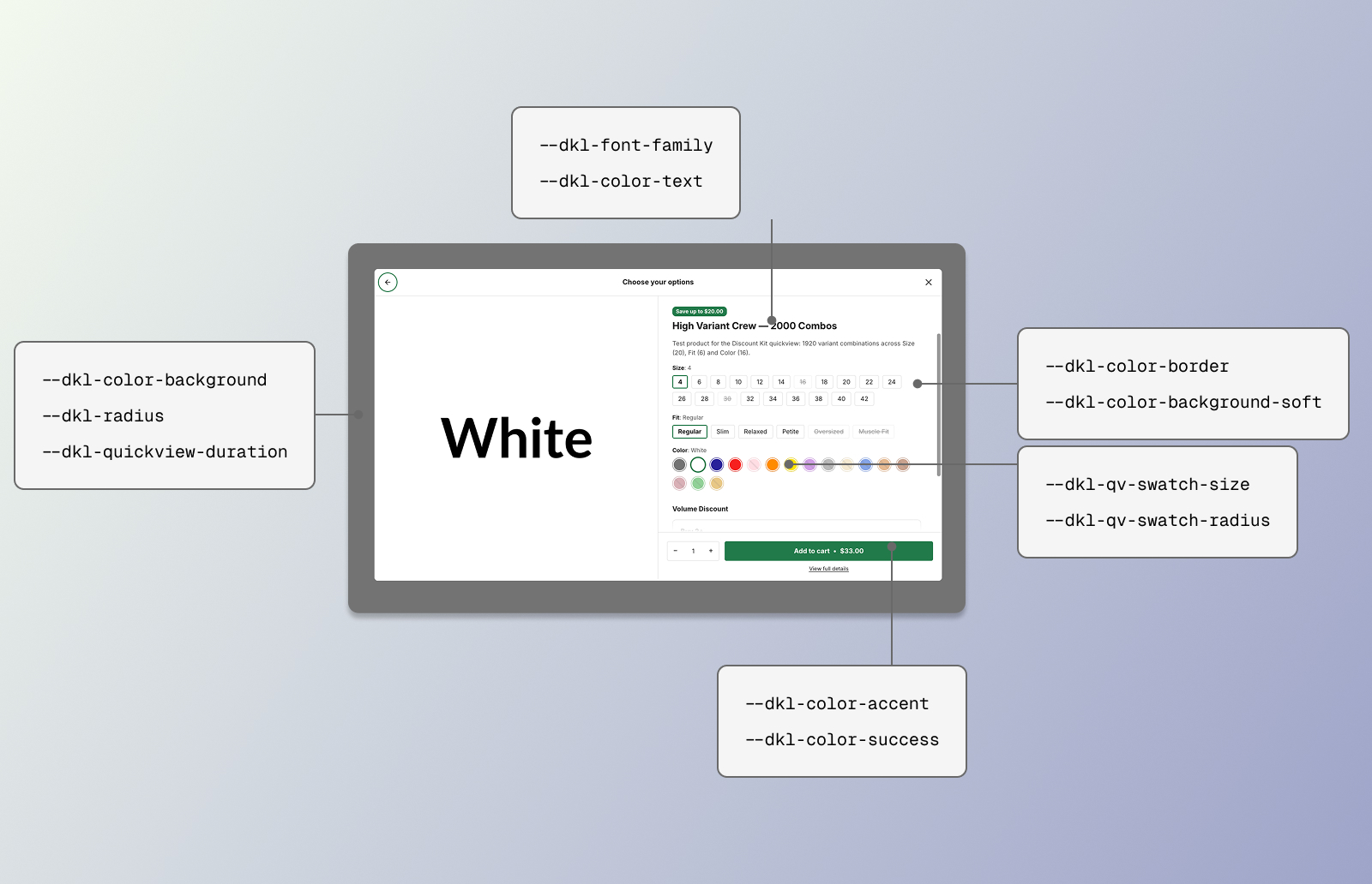 CSS styling tokens for the DKL Quickview component - panel: add to cart
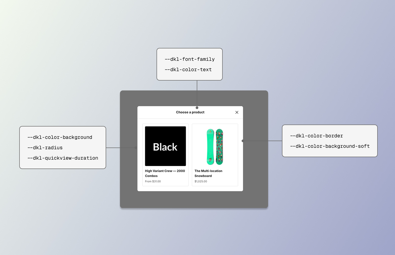 CSS styling tokens for the DKL Quickview component - panel: product selection
The dialog lives in a shadow root, but CSS custom properties inherit through the shadow boundary — so it picks up the global brand tokens you already set for the other components, and the embed’s Brand settings style it with no extra work.
Brand tokens the dialog consumes
Section titled “Brand tokens the dialog consumes”--dkl-font-family
Section titled “--dkl-font-family”default: inherit
Dialog typography.
--dkl-color-text
Section titled “--dkl-color-text”default: #1a1a1a
Body text.
--dkl-color-accent
Section titled “--dkl-color-accent”default: #217a4a
Add-to-cart button, selected option pill, focus rings.
--dkl-color-success
Section titled “--dkl-color-success”default: #217a4a
The “Added to cart” state.
--dkl-color-border
Section titled “--dkl-color-border”default: rgba(0,0,0,.04)
Option pills, header and footer dividers, the stepper.
--dkl-color-background
Section titled “--dkl-color-background”default: #fff
Dialog surface.
--dkl-color-background-soft
Section titled “--dkl-color-background-soft”default: rgba(0,0,0,.04)
Hover states and skeleton placeholders.
--dkl-radius
Section titled “--dkl-radius”default: 8px
Dialog corners, pills, and buttons.
Quickview tokens
Section titled “Quickview tokens”--dkl-quickview-duration
Section titled “--dkl-quickview-duration”default: 220ms
Open / close animation duration (the desktop fade-and-rise and the mobile drawer slide).
Disabled entirely under prefers-reduced-motion.
--dkl-qv-swatch-size
Section titled “--dkl-qv-swatch-size”default: 2rem
Width and height of a colour / image swatch chip.
--dkl-qv-swatch-radius
Section titled “--dkl-qv-swatch-radius”default: 50%
Swatch chip corners — 50% for circles, var(--dkl-radius) to match the pills.
CSS parts
Section titled “CSS parts”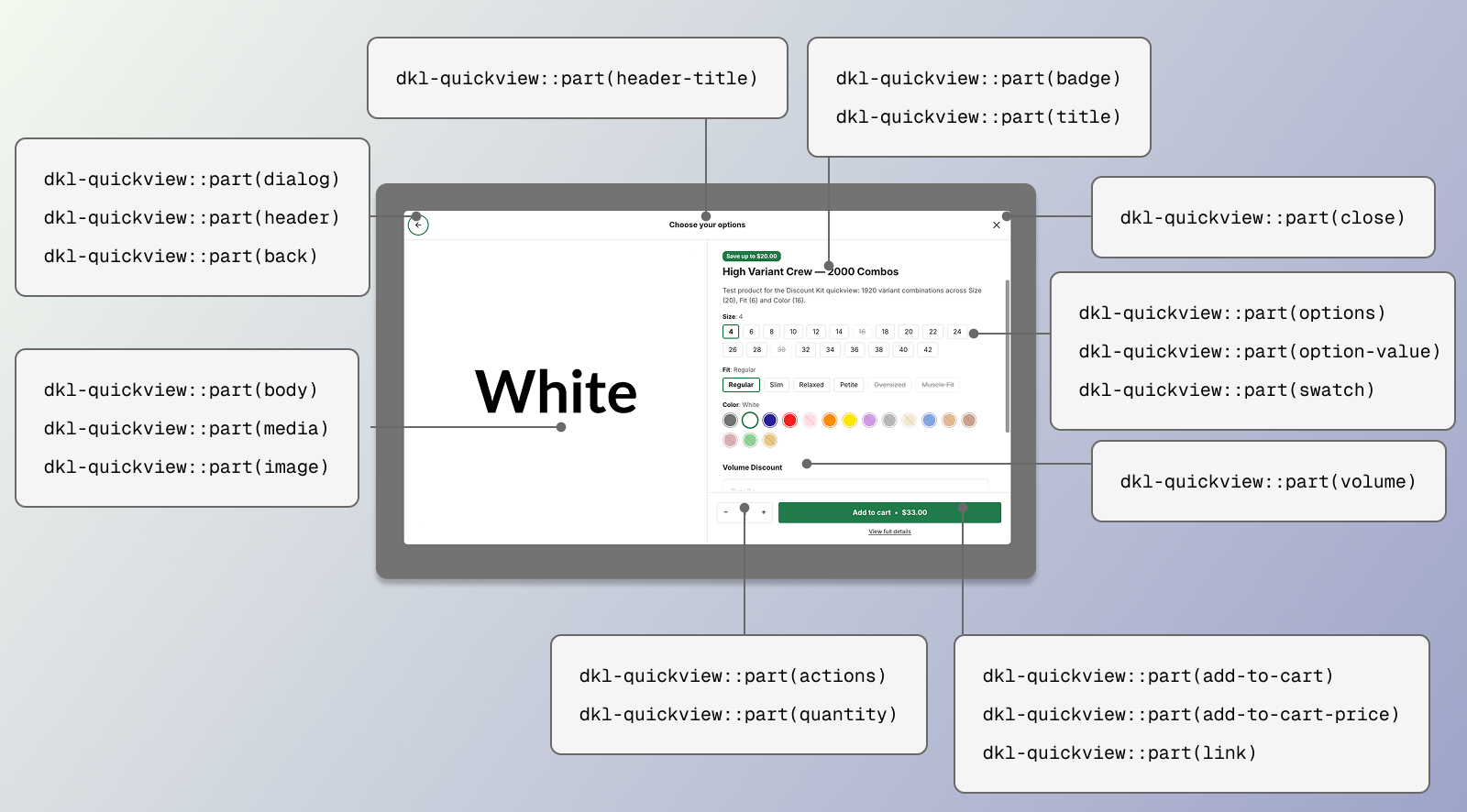 CSS parts for the DKL Quickview component - panel: add to cart
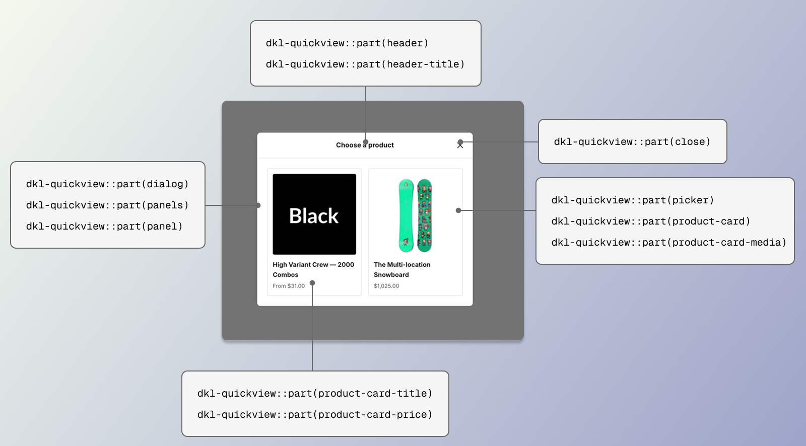 CSS parts for the DKL Quickview component - panel: product selection
For structural restyling beyond what the tokens cover, the dialog exposes ::part() hooks on
the dialog host. Target them from your theme’s CSS:
dkl-quickview[data-dkl-dialog-host]::part(dialog) { border-radius: 0; }dkl-quickview[data-dkl-dialog-host]::part(add-to-cart) { text-transform: uppercase; }dkl-quickview[data-dkl-dialog-host]::part(option-value-unavailable) { opacity: 0.3; }Dialog shell
Section titled “Dialog shell”dialog
Section titled “dialog”CSSPart
The <dialog> itself. ::part(dialog)::backdrop styles the backdrop.
header
Section titled “header”CSSPart
The header row — back button (left, multi-product only), centred heading, close button (right). Its bottom border matches the footer’s.
header-title
Section titled “header-title”CSSPart
The centred header heading. Empty on single-product opens unless an options heading is set.
CSSPart
Close button.
CSSPart
Back-to-picker button. Hidden outside the multi-product options screen.
skeleton
Section titled “skeleton”CSSPart
Loading placeholder — shaped like the real layout (image, title, description lines, option groups, quantity + add-to-cart) so nothing reflows when the product lands.
Product screen
Section titled “Product screen”CSSPart
The layout grid. Desktop: media left, title and scrolling info right. Mobile: a small image beside the title, info below.
media / image
Section titled “media / image”CSSPart
The image pane / the <img> (a header thumbnail on mobile).
CSSPart
The product title <h2>.
CSSPart
The info column — holds the scroll region and the pinned footer.
info-scroll
Section titled “info-scroll”CSSPart
The scrollable region (description, options). Gains is-clipped-top / is-clipped-bottom
classes as it scrolls, which fade the clipped edge.
description
Section titled “description”CSSPart
The clamped product description.
volume
Section titled “volume”CSSPart
Each in-dialog Volume Picker, below the options.
The picker’s own --dkl-vp-* tokens and parts apply inside.
Options
Section titled “Options”options
Section titled “options”CSSPart
The variant selector as a whole.
option / option-name / option-values
Section titled “option / option-name / option-values”CSSPart
Each option’s <fieldset> / its <legend> / the row of values.
option-selected
Section titled “option-selected”CSSPart
The selected value shown inside the legend (“Size**: 24**”).
option-value
Section titled “option-value”CSSPart
A value pill. Also carries option-value-unavailable when sold out or incompatible, and
option-value-swatch when it renders a swatch.
swatch
Section titled “swatch”CSSPart
The colour / image swatch chip.
Footer
Section titled “Footer”actions
Section titled “actions”CSSPart
The pinned footer — quantity, add-to-cart, message line, details link.
quantity / quantity-button / quantity-input
Section titled “quantity / quantity-button / quantity-input”CSSPart
The stepper and its controls.
add-to-cart
Section titled “add-to-cart”CSSPart
The add-to-cart button. Also carries add-to-cart-success after a successful add and
add-to-cart-pending while a variant change resolves (shimmer).
add-to-cart-label
Section titled “add-to-cart-label”CSSPart
The button’s text (“Add to cart” / “Sold out” / …).
add-to-cart-price / add-to-cart-amount / add-to-cart-compare
Section titled “add-to-cart-price / add-to-cart-amount / add-to-cart-compare”CSSPart
The inline price group / the price / the struck-through compare-at.
message
Section titled “message”CSSPart
The status / error line. Carries message-error when showing an error.
CSSPart
The “View full details” link.
Multi-product picker
Section titled “Multi-product picker”panels
Section titled “panels”CSSPart
The panel viewport (multi-product opens only).
CSSPart
Each screen. Also carries panel-products (the picker) or panel-product (the options
screen).
picker
Section titled “picker”CSSPart
The product-card list. Desktop: a card grid, up to three across (two for exactly two); mobile: thumbnail rows. Scrolls only past six cards.
product-card
Section titled “product-card”CSSPart
A picker card. product-card-media / product-card-title / product-card-price for its
pieces.
Selection tray
Section titled “Selection tray”The parts the Gift Selector
adds in selection mode — tray, slot, add-all and their pieces — are documented with it.
Examples
Section titled “Examples”:root { --dkl-color-accent: #111111; --dkl-radius: 0px;}:root { --dkl-quickview-duration: 320ms;}:root { --dkl-qv-swatch-size: 2.5rem; --dkl-qv-swatch-radius: var(--dkl-radius);}dkl-quickview[data-dkl-dialog-host]::part(dialog)::backdrop { background: rgba(20, 20, 20, 0.7); backdrop-filter: blur(4px);}dkl-quickview[data-dkl-dialog-host]::part(link) { text-decoration: underline; font-weight: 600;}