Styling & Data Attributes
This is the shared reference for <dkl-sale-badge> — the data-* attributes that drive
its behaviour and the --dkl-badge-* tokens that style it. The app
block settings map onto these; on a web component
you set them directly.
Data attributes
Section titled “Data attributes”The attributes you set on the tag. Everything else the badge reads — the sale’s offer, the variant’s price and compare-at, the money format — the carrier supplies, so it isn’t listed here.
data-component
Section titled “data-component”string · default: none
The handle of a component built in the admin. Its sale, styling and text come with it.
data-discount-id
Section titled “data-discount-id”string · default: none
The sale’s metaobject handle; the discount- prefix is optional. Use this instead of
data-component for the built-in look. One of the two is required — a tag with neither
renders nothing.
data-label
Section titled “data-label”string · default: Save up to [amount]
Label template; [amount] is replaced with the formatted amount.
data-additional-message
Section titled “data-additional-message”string · default: none
A second line on the badge, sharing its background. Absent or empty renders no element.
data-message-position
Section titled “data-message-position”"below" / "above" · default: below
Where the additional message sits relative to the label.
data-width
Section titled “data-width”"fit" / "full" / "max" · default: fit
The component’s width: its natural size, the full column, or the full column up to
--dkl-badge-max-width — the last stays fluid, so a narrow screen shrinks it rather
than overflowing.
data-alignment
Section titled “data-alignment”"left" / "center" / "right" · default: left
How the label and message sit inside the component. Only visible when the component is
wider than its text (full or max).
CSS styling tokens
Section titled “CSS styling tokens”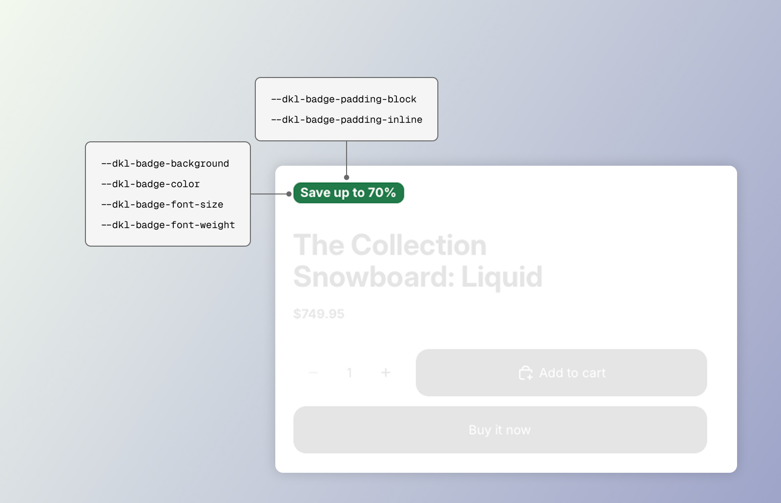
CSS styling tokens for the DKL Sale Badge component
The stylesheet (loaded site-wide by the embed) styles the host element directly — the
host is the badge, so target dkl-sale-badge { … } (there are no CSS parts). Set any
token above the element — :root, the embed’s Custom CSS, an inline style, or the block’s
scoped rule. Sizes are multiplied by --dkl-text-scale, so they follow the shopper’s
browser font-size setting.
--dkl-badge-background
Section titled “--dkl-badge-background”default: var(--dkl-color-accent)
Badge background — the whole component, message included.
--dkl-badge-color
Section titled “--dkl-badge-color”default: #ffffff
Badge text.
--dkl-badge-radius
Section titled “--dkl-badge-radius”default: var(--dkl-radius)
Badge corners.
--dkl-badge-margin-top / --dkl-badge-margin-bottom
Section titled “--dkl-badge-margin-top / --dkl-badge-margin-bottom”default: 0
Space above and below the component.
--dkl-badge-padding-block
Section titled “--dkl-badge-padding-block”default: 4px (2px at ≤ 768px)
Vertical padding.
--dkl-badge-padding-inline
Section titled “--dkl-badge-padding-inline”default: 8px
Horizontal padding.
--dkl-badge-gap
Section titled “--dkl-badge-gap”default: 4px
Space between the label and the additional message.
--dkl-badge-max-width
Section titled “--dkl-badge-max-width”default: 200px
The cap when data-width="max".
--dkl-badge-font-size / --dkl-badge-font-size-mobile
Section titled “--dkl-badge-font-size / --dkl-badge-font-size-mobile”default: 12px
Label text size; the -mobile value applies at ≤ 768px.
--dkl-badge-font-weight
Section titled “--dkl-badge-font-weight”default: 600
Label text weight.
--dkl-badge-font-family
Section titled “--dkl-badge-font-family”default: inherit (→ --dkl-font-family)
Label and message font — only renders if the theme loads that font.
--dkl-badge-message-font-size / --dkl-badge-message-font-size-mobile
Section titled “--dkl-badge-message-font-size / --dkl-badge-message-font-size-mobile”default: 12px
Additional message size; the -mobile value applies at ≤ 768px.
--dkl-badge-message-color
Section titled “--dkl-badge-message-color”default: inherit (→ --dkl-color-text)
Additional message colour.
A badge component’s colours, spacing, corner radius, width, sizes and weight feed the
matching tokens via a scoped <style> rule.
Examples
Section titled “Examples”<dkl-sale-badge style=" --dkl-badge-background: #111; --dkl-badge-color: #fff; --dkl-badge-radius: 999px; --dkl-badge-font-size: 0.85rem; --dkl-badge-font-weight: 700; "></dkl-sale-badge>:root { --dkl-badge-background: #111; --dkl-badge-color: #fff; --dkl-badge-radius: 999px;}dkl-sale-badge { letter-spacing: 0.02em; text-transform: uppercase;}