<dkl-price> — the data-* attributes that drive its
behaviour, the --dkl-* tokens that style it, and the CSS parts you can target. The app
block settings map onto these; on a web component you set them directly.
Using this reference with the app blockWhen you place the DK: Price app block, it renders its own
<dkl-price> and writes these values for you — so what applies depends on the kind of override:Data attributes - No:
The block sets every data-* itself, from its App block settings and the resolved discount. Adding data-* to your own markup has no effect on a block instance; they’re the configuration surface for the web component only. To change block behaviour, use its settings.CSS styling tokens — Yes: T
hey’re CSS custom properties that inherit
through the shadow boundary, so they style a block exactly like a web component. The block’s
colour / radius / spacing pickers just write the matching tokens into a scoped <style> rule
for you. Any token not exposed as a setting (e.g. --dkl-price-gap, --dkl-price-font-size)
you can still set yourself from your own CSS — :root, the embed’s Custom CSS field, or a
rule targeting the block.CSS parts — Yes:
The shadow DOM is identical, so ::part() works the same on a
block or a web component.Data attributes
All optional — on a web component the carrier supplies them by default. Set one to override.The regular price — the component’s base amount.
The native sale compare-at price. Struck through when no tier is active.
Money format string. Falls back to
Shopify.formatMoney, then Intl.Show the savings badge (saving versus the original / highest price).
How the savings badge displays the saving.
The badge’s leading label, e.g. “Save 15%”.
Connector between the sale saving and the tier saving, e.g. “Save 10% + an extra 15%”.
Set by the component while a tier is active — a styling hook only. Don’t author it yourself.
CSS styling tokens
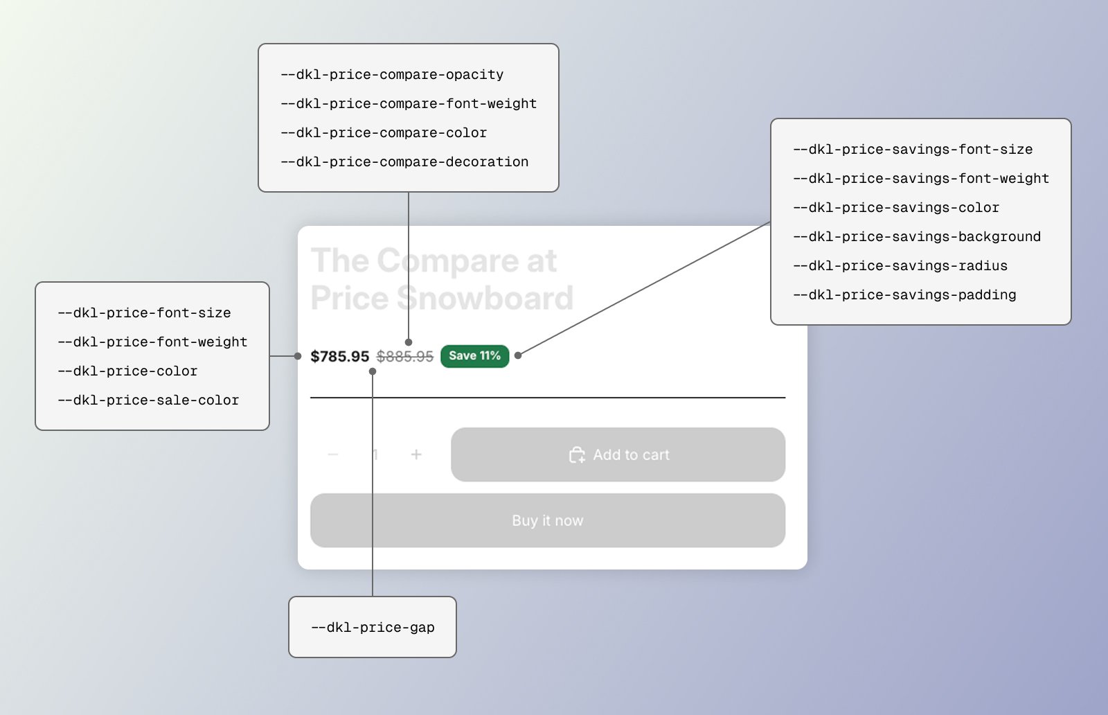
<dkl-price> has no shadow <style> — its stylesheet (loaded site-wide by the embed) is
the single source, styling the host and parts. Set any token above the element (:root,
the embed’s Custom CSS, an inline style, or the block’s scoped rule).
Gap between price and compare-at.
Font size for all price entities (main price, compare-at, savings badge)
Main price font weight
Main price color
Main price while a tier is active (
[data-dkl-discounted]).Struck-through compare-at opacity
Compare-at font weight
Compare-at color
Compare-at text decoration
Savings badge font size
Savings badge font weight
Savings badge text color
Savings badge background color
Savings badge corner radius
Savings badge padding (vertical and horizontal)
--dkl-font-family and --dkl-color-text.
CSS parts
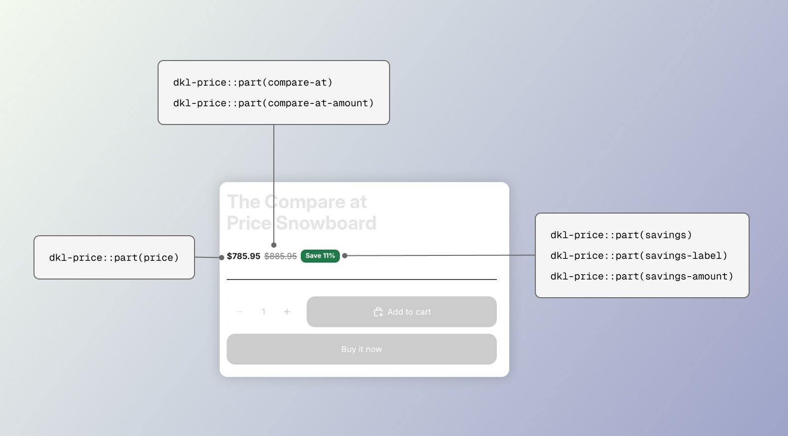
<dkl-price> is fully shadow DOM. Target its internals with ::part().
The main price (the discounted price while a tier is active).
The struck-through compare-at wrapper.
The compare-at number.
The savings line wrapper.
The savings label text.
The savings amount.
Examples
Style via :root tokens
Style via ::part()
Data attribute overrides for web component
Next steps
App block
Configure these via theme-editor settings.
Web Components
Set these directly on the tag.