<dkl-volume-picker-radio-groups> — the data-* attributes
that drive its behaviour, the --dkl-* tokens that style it, and the CSS parts and light-DOM
classes you can target. The app block settings map onto
these; on a web component you set them directly.
Using this reference with the app blockWhen you place the DK: Volume Groups app block, it
renders its own
<dkl-volume-picker-radio-groups> and writes these values for you — so what
applies depends on the kind of override:Data attributes - No:
The block sets every data-* itself, from its App block settings and the resolved discount. Adding data-* to your own markup has no effect on a block instance; they’re the configuration surface for the web component only. To change block behaviour, use its settings.CSS styling tokens — Yes:
They’re CSS custom properties that inherit through the shadow boundary, so they style a block exactly like a web component. The block’s colour / radius / spacing pickers just write the matching setting-backed tokens into a scoped <style> rule for you. Any token not exposed as a setting (e.g. --dkl-vp-legend-spacing, --dkl-vp-list-gap) you can still set yourself from your own CSS — :root, the embed’s Custom CSS field, or a rule targeting the block.CSS parts and classes — Yes:
The shadow DOM and light-DOM markup are identical, so ::part() and the .dkl-volume-picker__* classes work the same on a block or a web component.Data attributes
Set asdata-* on the host. On a web component the carrier supplies the data attributes; the
behaviour toggles default off.
Which discount’s carrier to clone. The
discount- prefix is optional; an attribute-less
tag uses the default (first eligible).Presentation: stacked cards, or a compact button grid (the per-tier price line is hidden).
Money format for JS-reformatted prices.
Instance id; disambiguates multiple widgets.
Whether selecting a tier updates the displayed price — the theme’s native price element and
the
<dkl-price> component (via the tier-change event’s
updatesPrice flag). When false, the event still fires for custom integrations, but no
price display reflects the tier.Override or disable the price element target. Use
"none" when pairing with
<dkl-price>.Sync the theme’s quantity selector to the selected tier’s quantity.
Override or disable the quantity input target.
An extra theme event to also drive quantity sync, on top of
quantity-selector:update.
The component reads the quantity from the event’s detail.quantity, or re-reads the form
input if absent.Disable tiers when the variant is already on sale.
Label shown when a tier is unavailable.
Sold-out variants disable the tiers (on initial render and on variant change),
independently of
data-exclude-sale-prices — a selectable tier on a variant the form
won’t add would be a dead end.Per-tier attributes (data-dkl-*)
Per-tier attributes (data-dkl-*)
Server-rendered onto each
input.dkl-volume-picker__radio; the component reads them. You
don’t set these by hand — they’re listed for reference.The tier’s position in the group.
How the tier’s discount is expressed.
The fixed discount amount (when
fixedAmount).The discount percent (when
percentage).The pre-computed discounted unit price.
CSS styling tokens
- Layout: Cards
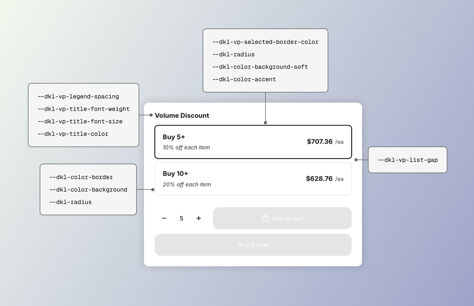
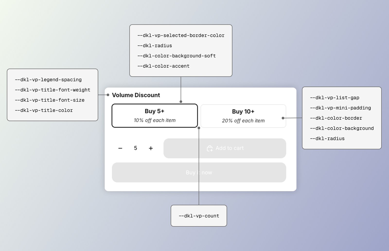
<style> for the title/list structure, and the light-DOM card chrome
in the stylesheet. The card chrome mostly consumes the
global brand tokens so cards match the theme.
Structure
Space below the title row.
Group title font weight.
Group title font size.
Group title color.
Gap between options.
Mini-buttons grid columns.
Mini-buttons option padding.
Border and ring of the selected tier.
Resting card border.
Card corners.
Card background.
Hover background.
Focus-visible outline.
CSS parts and classes
The title/list scaffold is in shadow DOM (parts); the radio cards are slotted light DOM (classes).Parts
- Layout: Cards
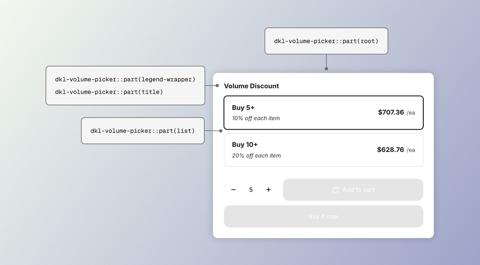
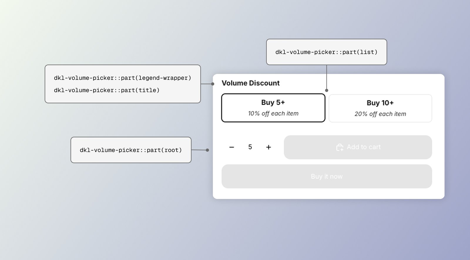
The
<fieldset> wrapper.The title row.
The
<legend> group title.The radiogroup holding the options.
Light-DOM classes
One tier card (selected:
:has(.dkl-volume-picker__radio:checked)).The radio input.
Card inner row.
Title + discount stack.
Tier heading (e.g. “Buy 3+”).
The “X% off each” line.
Per-tier price.
The unit suffix (e.g. “/ea”).
“No discount” placeholder.
Examples
Recolour the selected card border
Tighter list, bolder titles
Compact button layout
Next steps
App block
Configure these via theme-editor settings.
Web Components
Set these directly on the tag.